No. 01
Documentary
Objektif
In an Istanbul that millions pass through but few truly see — a photographer’s journey into the city’s abstract, black-and-white world, stripped of its excess.
Visual Communication Design student working across editorial design, brand identity, typography, video and digital products.
15 projects · editorial, identity, typography and motion.
In an Istanbul that millions pass through but few truly see — a photographer’s journey into the city’s abstract, black-and-white world, stripped of its excess.
İKİLEM (“Dilemma”) sets minimalism against maximalism through design, architecture, film and everyday life. From Dieter Rams to Ettore Sottsass, from brutalist architecture to Wes Anderson, it explores the tension between the calm of less and the exuberance of more.
A folded promo brochure carrying İKİLEM’s visual language. The front features the cover and editor’s note; the back plays up the minimalism–maximalism contrast.
A concept promo brochure for Baneva’s album b!end, bringing an album analysis, the tracklist and cover art into a single editorial piece.
Benfica has long been one of Portuguese football’s leading names, with a club identity known worldwide for its success and fan culture. This project keeps that heritage while moving the brand toward a more contemporary, dynamic and confident visual language.
Front cover, back cover and bookmark for the book Elektrik Yağmuru (“Electric Rain”). Neon tones and a night-city mood tie the series together from cover to bookmark.
Two concept film posters: “Balıkçı” (The Fisherman), built around a dramatic portrait, and a landscape reinterpretation of “Kong: Skull Island”.
Album and single covers for different genres and moods — eight distinct visual languages built with type, photography and collage.
A concept business card for a personal design studio — front and back built on a warm retro palette and bold display type.
A SuYolu brand poster built with traditional Turkish kilim motifs, and an Instagram carousel introducing Düzce’s landmarks.
A vertical explainer animation answering “How does a rocket fly?” in 55 seconds.
A three-dimensional alphabet where every letter takes on a different material and character, applied to a mug.
A monogram drawn from my initials (S · N · Y), shown on light and dark grounds.
Typograms that visualise a word’s meaning through letterform, and a modern calligraphy composition in blackletter.
Two specimen posters presenting the history, weights and character sets of San Francisco and Verdana.
Web apps I designed and built from my own needs — live and in use.

A web app you can install on iPhone and Mac to track your subscriptions, billing dates and monthly spend in one place.

An app for university students that brings the class schedule, weekly notes, assignments and attendance into one screen.
Short-form video work across lyric edits, showreels and animation.
My design account — new work and process shots land here first.
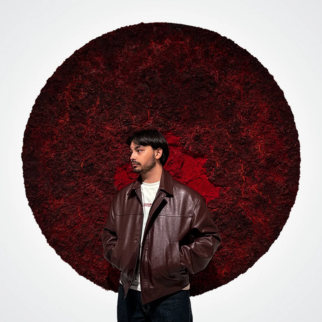
I’m a third-year Visual Communication Design student at Istanbul Medeniyet University. I work across graphic design and videography — print pieces like magazines, brochures, book covers and brand identities, alongside video editing and motion content. Lately I’ve been bringing the same design eye to web apps I build myself.
I care about function as much as aesthetics. I’m detail-oriented, open to growth and I simply love making things.
Istanbul Medeniyet University
Visual Communication Design
3rd year
Photoshop
Illustrator
After Effects
Premiere Pro
InDesign
Audition
CapCut
Claude
Editorial & print design
Brand identity · Typography
Video editing & animation
Web apps
Ran the team’s social accounts, laid out the technical report and designed the sponsorship deck.
Creating and publishing content for the club’s account.
Managed the association’s social media account and created its content.